
A floor mat is the first thing guests step on and the last thing you see leaving. Here is how to make it look chosen, not just placed.
By FloorHug Team · 16 November 2026 · 7 min read
In this guide
Styling a mat is mostly one skill: matching quiet things to busy things. A home already has texture — wood grain, tile lines, cabinet fronts, throw pillows. A FloorHug mat works best when it adds one calm layer instead of competing with all of them.
Door mat styling: the entryway rule of three
Every great-looking entryway follows this simple trio: soft texture, structured pieces, and a touch of life. Your door mat brings softness. A bench, storage basket or console table gives clean structure. A plant adds living warmth. Leave out one element, and the nook feels incomplete. Add a fourth bulky item, and it looks over-staged.
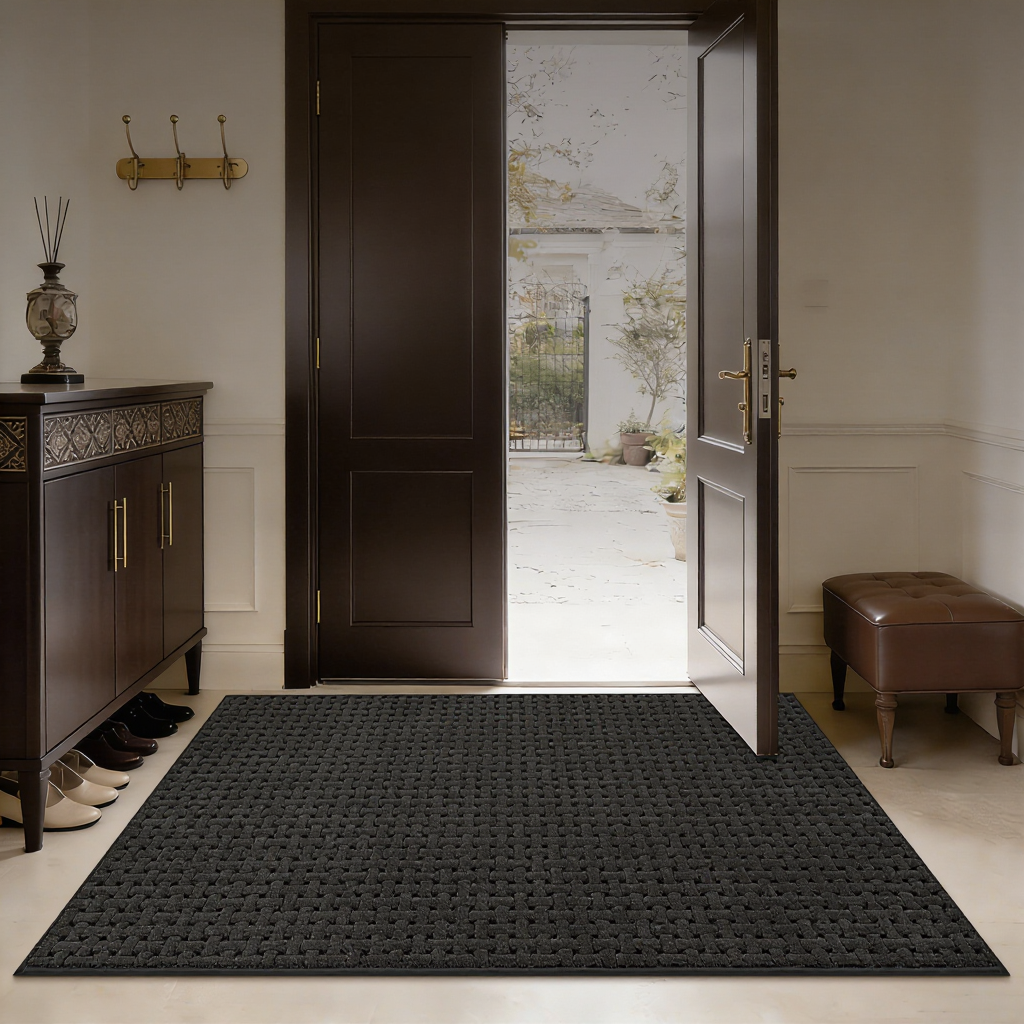
Style your entryway with a FloorHug door mat: Mat for softness, bench for structure, plant for life — that’s the simple formula.Size matters too. Pick a mat that extends a hand’s width past the door frame on both sides to frame your doorway. If it sits fully inside the frame, it will feel like an afterthought. At roughly 0.45 inches thin, this mat won’t catch when you open the door. You can place it right up against the door with no extra gap needed.
A floor mat colour palette for wood floors
Warm-toned floors — oak, walnut, most engineered wood — pair naturally with the warm end of any palette. The question is only how much contrast you want. Three pairings cover almost every room:
| If your floor and door look like… | Choose a mat in | The effect |
|---|---|---|
| Light oak floor, white or pale door | Oat and beige tones | Quiet and seamless — the mat disappears into the room |
| Mid-tone floor, wood or painted door | Terracotta and warm grey | Soft contrast — the mat reads as a deliberate accent |
| Dark walnut floor, black or dark door | Light beige with texture | Full contrast — the mat becomes the anchor of the entry |
One pairing to avoid: light grey mat on grey-washed floor. Close tones with no texture difference read as accidental.
Kitchen rug ideas for four cabinet colours
FloorHug kitchen rugs come in four patterns, each sold as a set of two — a short mat for the sink and a long runner for the island or stove run. The pattern choice is really a cabinet-colour decision:
White and shaker cabinets
Anything works, which is why white kitchens are the easiest to style. Strips add structure without adding noise — the safest first choice.
Grey cabinets
Go warmer than the cabinets. Petals or leaves in grey with a warm undertone keep the kitchen from drifting cold; the taupe strips do the same job with more contrast.
Wood and butcher block
Leaf patterns echo what the wood is already doing. Keep the rug pattern quieter than the grain — a strong leaf print on a strong grain reads as clutter.
Navy or deep green
Grey strips. The pattern's straight lines calm the strong cabinet colour instead of adding another voice to it.
Stair tread styling that stays quiet
The stairs see every colour in the house at once, which is exactly why a stair tread should be the quietest mat you own. FloorHug stair treads come in beige, light beige, grey and dark brown — all chosen to sit under the noise, not add to it.
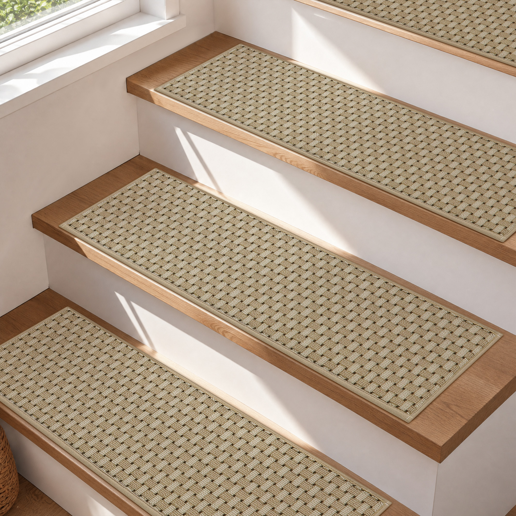
Two looks cover most staircases. Match the tread to the wood for a continuous, almost invisible look — the staircase simply becomes softer to walk on. Go one step lighter than the floor for a defined edge on every step, which also happens to help eyes find each step in dim light. Dark brown treads earn their place on very pale floors; anywhere else, they divide the staircase into stripes.
Seasonal switches, autumn to holidays
The mats stay. Everything around them changes — that is the low-effort way to restyle a home each season without buying new floor covering.
- Autumn: the terracotta and oat end of the palette is already seasonal. Add a wool throw or a wreath in the same warm family and the entry is done.
- Black Friday and the holidays: swap the soft layer, not the mat — a green garland on the stair rail, darker pillows by the door. Beige and grey mats keep every festive colour looking intentional.
- After the holidays: the fastest reset is removing everything you added. A neutral mat plus a plant is the year-round baseline, and it always works.
Styling questions we hear most
Can I mix two patterns from the same colour family?
Yes, if one is stripes and one is organic. Two organic prints (petals and leaves) fight; a strip next to a leaf reads as layered on purpose.
Should the mat match the door or the floor?
The floor. The mat lies on the floor and shares its light; the door is above eye level and mostly seen open or closed, not compared.
What colour mat hides the most dirt?
Mid-tones with texture — oat, warm grey, heathered beige. Very dark mats show dust and crumbs; very light ones show wet marks. Mid hides both.
Do the stair treads have to match the kitchen rug?
No, and they usually look better if they do not match exactly. Keep them in the same warm or cool family; the wood between the two rooms does the blending.